What are the characteristics of the Franco-Colombian flag?
The Franco-Columbian flag combines the dogwood with the fleur-de-lis. It features blue lines and a yellow circle evoking the sea, the mountains and the sun, reflecting the dual identity of Franco-Colombians and their love of British Columbia’s natural environment.
What are the recent reflections on the Franco-Colombian flag?
In 2023, students at the Conseil scolaire francophone de la Colombie-Britannique reflected on the multiple roles flags play as cultural rallying points, identity-building tools and strategies for promoting the visibility and acceptance of minority communities. In honour of Mr. Lemoine’s legacy, francophone students from grades 3 to 12 participated in a collaborative project to design the first Franco-Colombian pride flag. Their designs reflect the overall commitment to reconciliation and intersectionality, with symbols to honour the rights, perspectives and priorities of Aboriginal and racialized people.
How did the Franco-Colombian pride flag design project impact students in British Columbia?
This project encouraged students to see themselves as protagonists of cultural change at the crossroads of reconciliation, anti-racism, the affirmation of LGBTQIA+ rights and the construction of a francophone identity in a minority setting. It also highlighted their power to shape the values that the community displays on a national scale: Radio Canada approached the students in June 2023 to interview them to find out more about their wishes and their vision of the community’s future.
The students greatly appreciated the support of the Francophone Teachers’ Union, the Western Franco-Queer comittee, the Conseil jeunesse francophone de la Colombie-Britannique, the Fédération des Francophones de la Colombie-Britannique, and the Association Canadienne d’Éducation de Langue Française, which supported the production of a short video presenting the flag as an example of a secure and celebratory identity-building project.
In February, the Conseil scolaire francophone de la Colombie-Britannique ordered a flag for each of its 46 schools across the province. Interest in the heritage of identity-building in British Columbia has borne two fruits: Raymond Lemoine’s Franco-Colombian flag and the Franco-Colombian Pride flag are now available in the FFCB’s virtual boutique.
Building a francophone identity in a minority setting: an intergenerational commitment
What are the differences between the two flags?
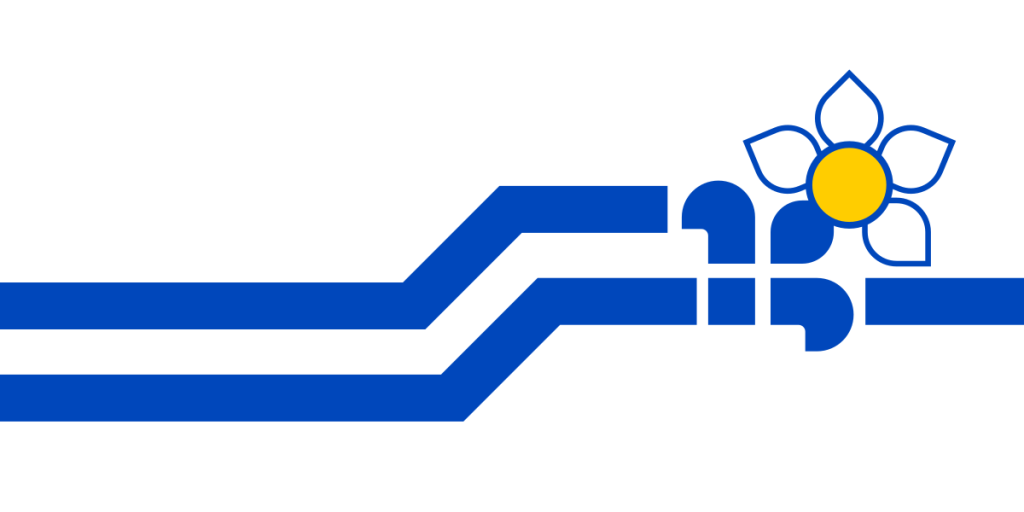 The Franco-Colombian flag (1981), designed by Raymond Lemoine as part of a design competition. “The blue lines evoke the sea, while the blue lines evoke the mountains. The fleur-de-lis represents both the local and international community. It points towards the middle of the dogwood flower, the floral emblem of British Columbia, and the two are joined by a petal to signify that the province is enriched by the Francophone presence. The yellow circle symbolizes the sun. The fleur de lys points to the sun, a source of hope, to show the way to the next generation of young people who will have to find their place as Francophones in British Columbia.” (Lemoine, 2023)
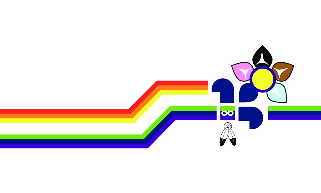 The Franco-Colombian Pride Flag (2023), designed as part of a community design project. “I was very pleased to learn that there were CSF students working on the creation of a Francophone pride flag for British Columbia, and that most of these young people would be inspired by the existing Francophone flag. For me, it was sort of a natural evolution, given that the BC Francophone flag has a clearly inclusive theme… It’s important to create a symbol signifying the inclusion and celebration of the Pride community by Francophones here and abroad.” (Lemoine, 2023)
How do the symbols of the Franco-Colombian pride flag reflect the inclusion and celebration of diversity within British Columbia’s Francophone community?
The two rainbow lines: The two lines recall the six colors of the rainbow flag produced in 1979 by artist Gilbert Baker at the request of Harvey Milk, America’s first openly homosexual politician. According to Baker, red represented life, orange comfort, yellow sunshine, green nature, blue art and purple spirituality. The two lines respect the original sequence of these colors on Baker’s pride flag, while underscoring the 2SGLBTQIA+ community’s roots in the British Columbia landscape.The fleur-de-lys, infinity symbol and two feathers: The fleur-de-lys is the symbol of the French-speaking world, while the infinity symbol represents the Métis Nation. The infinity symbol appears inside the fleur-de-lis to emphasize that the Métis are part of the French-speaking community. However, the infinity symbol appears on a green, dark blue and violet background, rather than on a dark blue background, to emphasize that the Métis are a distinct people with a distinct perspective on nature, art and spirituality. The two feathers are used by Métis and First Nations communities to signal inclusion and respect for Two-Spirit, Indigenous and LGBTQIA+ people. Its inclusion in the flag underscores that Aboriginal understanding of gender diversity is essential to British Columbia’s francophone community.
Dogwood: Four petals of the dogwood now take on the colors black, brown, pale blue, pink and white. These colors appear in the chevron that American designer Daniel Quasar added to the Pride flag in 2018 to further emphasize the inclusion of racialized, trans and non-binary people in the community. The shape of the white at the center of these petals is that of the trigon, a central design element in Coast Salish First Nations art highlighting indigenous representations of the natural landscape and reminding us that Aboriginal peoples have been stewards of the land since time immemorial. A purple band encircles the yellow center of the flower to represent intersex people, echoing the intersex pride flag created in 2013 by Morgan Carpenter. The trigones emphasize the circle, recalling its central role in indigenous perspectives and practices. One petal of the flower remains dark blue, emphasizing the connection between the past and future of British Columbia’s francophonie.